A UX case study conceptualizing a gentle update for the Wealthsimple investment platform which would add viewing options and tools for day traders without cluttering the UI.
Problem
Wealthsimple exemplifies its namesake: it is a platform for beginner investors to buy and sell stocks, ETF’s and other securities.
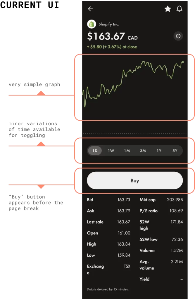
While the simplicity makes comprehension and ease-of-use top priority, anyone who really wishes to pursue active trading on shorter time frames has to navigate away from Wealthsimple in order to make the most informed decisions and to perform detailed activities like monitoring price movements over time.
Wealthsimple may be losing out on a salvageable portion of market share due to this platform migration.

Opportunity
Traders who are advancing in their knowledge tend to migrate away from Wealthsimple to Questrade or similar platforms due to those alternatives providing greater access to necessary information for making informed decisions in what is known as intraday trading, or more simply, day trading.
I hypothesize that Wealthsimple could effectively prevent some of this “brain drain” of beginner-intermediate retail investors by providing just enough of a boost in flexibility and choice for accessing granular information, in-app, during intraday trading scenarios while also maintaining the overarching principle of simplicity that guide’s the overall user experience.
🔍 Discovery & Definition
User Interviews:
- Intraday investors/traders who conduct trades via mobile apps; discover workflow; annotate key terminology and common approaches/techniques; identify common and essential data points being pursued
- Users who use Wealthsimple in addition to other platforms; apps and data points
User Feedback Analysis
- Target research in communities with beginner/intermediate retail investors such as subreddits dedicated to investing
Journey Mapping
- Develop User Journey Maps from interviews; wide consideration for use conditions; approach from service design perspective in construction of maps
User Flows
- Wealthsimple’s Buy/Sell VS Questrade Buy/Sell
- Capture Information Architecture; visually map feature for both platforms (possibly a 3rd) and perform comparative analysis
Synthesis – Design Brief
- Cross-reference from interviews to produce a shortlist of additions for UI update
- Maintain simplicity as a foundational principle; explore and test design solutions which heavily reduce and optimize the amount of information that appears in similar features on competitor platforms
- Develop User Personas from interviews and research gathered on investment forums (subreddits); consider demographic information
📐 Design & Delivery
- Pinch to zoom in and out

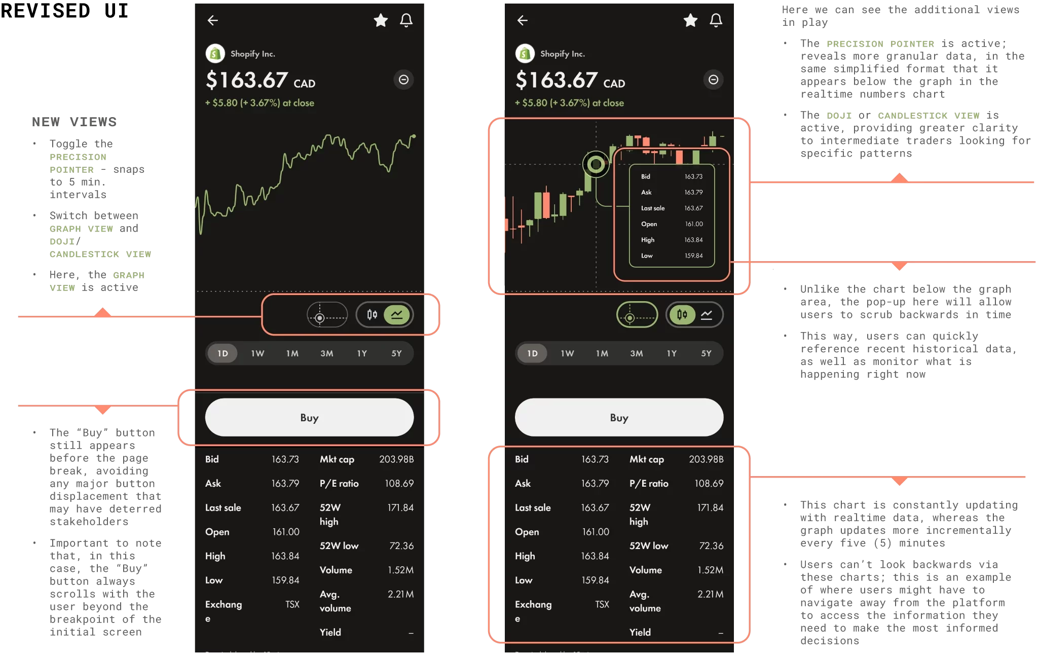
A rapid prototype displaying the integration of the commonly-observed candlestick pattern view into wealthsimple’s UI. The default remains the simple graph view, but the option is easily identifiable and immediately available in this rework.
This horizontal bar of space that the toggles occupy in the rework could potentially become home to multiple user-selected toggles from a list of common views and analysis perspectives found on the alternative platforms. An initial quantity of toggle slots is x4 due to spacing constraints and avoiding overcrowding; a simple left-right scroll could be implemented for users who need more than four distinct toggles available to them.
💡Paper Trading
Experts recommend that beginner investors stick to paper trading for around a year’s time before investing any real financial resources in the stock market or trading other securities such as Forex. They suggest picking stocks to observe and follow, regularly following financial news about those industries or individual stocks, and learning to perform the analyses necessary for making informed and calculated decisions.
For many who are investing for the first time, it may feel like a missed opportunity when there is such a low barrier for entry in order to test the waters.
I propose brainstorming an in-app feature for “paper trading”; a tool that takes realtime parameters and allows practice trades or a “practice-mode”. The feature will be accompanied by tutorials whose content is informed by feedback gathered in user interviews with intraday mobile traders, spotlighting the most preferred terminology, tools and techniques.
The principle behind any new feature we explore: keep it SIMPLE, even for intermediate or advanced traders.

Thank you for visiting! I can be reached via email at
Pages
Blog Posts
- Deconstructing The Imposter Within [Part I] — Impostor Syndrome, Futureshock & Personal Creative Expression
- Deconstructing The Impostor Within [Part II] — Expanding Oz & Effectively: The DBT App
- Deconstructing The Impostor Within [Part III] — A Five Step Plan For Resolving Feelings Of Impostor Syndrome